


20 December 2024

There’s been a lot of change here at smartclip in the past few years, yet our core values remain the same. We’re still defending the open internet and doing our part to democratise access to premium content. We still take a partner-driven approach to developing cutting-edge, privacy-first adtech solutions for European media owners. We still have a passion for architecting and safeguarding the future of Europe’s TV advertising ecosystem. We’re also still the adtech development unit of RTL. But our business has evolved, and we knew that to reflect the spirit and essence of who we are today, our brand identity needed to evolve as well.
We launched our previous branding in 2020, so the issue wasn’t that it was old or tired. It is an established brand, offering a distinctive look, feel, and tone that stands out in a highly competitive market. However, we needed to refocus and reestablish our brand identity after recent changes to ensure that anyone who comes in contact with our brand understands exactly what we’re about.
Our 2020 brand was built on the basis of a company with two focuses: media (ad sales) and tech (adtech solutions). This has now changed with the creation of RTL AdAlliance, which now houses the media division of smartclip, G&J iMS, and RTL AdConnect. Today, smartclip is focused solely on developing advertising technology for Europe’s largest media owners. Our 2020 brand was also heavily influenced by RTL Group’s brand identity, which has also recently undergone a major rebranding.
In addition to the RTL AdAlliance merger, smartclip LATAM was acquired in 2022, which — although a licensed partner — still led to some confusion in the market. A brand identity refresh was an opportunity to clarify our new core focus and unwavering position as Europe’s leading adtech provider.
Our goal was to maintain brand recognition but with a refreshed identity that better distinguishes us as an adtech company, clearly communicates our core values, has more synergy with the new RTL branding, and brings adtech to life with a level of creativity that’s rarely seen in our industry.
Moving forward, not backwards.
Delivering an impactful, innovative brand refresh — at a company that never stops innovating — was never going to be easy, and the project came with challenges. Having already taken huge strides in establishing the smartclip brand, we needed to ensure we were moving forward, not backwards. We had to stay recognisable while also communicating change — and ultimately create a brand identity that speaks our language now and in the future.
Making adtech tangible.
A thorn in the side of any adtech marketer is how to visually portray a company’s core competencies when the foundations of its products are hidden behind code. Because of this, our old visuals leaned towards the media side of our business. Showing on-screen ads, for example, is ‘sexier’ than the complex diagrams or flowcharts traditionally seen in adtech marketing. Now that we are 100% tech, we had to get creative and find a way to make adtech just as ‘sexy’ as media, and to make it more tangible — and we weren’t going to achieve that in adtech’s flowchart-filled comfort zone.
Crowded category, inflation, budget cuts, and tough deadlines.
As in any business activity, competition, costs, and timeframes also presented challenges. Our brand needs to compete with other well-established brands — many with deeper pockets than ours — in a crowded, constantly evolving industry. With inflation affecting all our marketing activities this year, we also needed to achieve our goals in the most cost-effective way. I ultimately wanted the team to find a way to compete with the largest global adtech providers without the cash — by using the power of design to find our unique angle.
In addition, for several reasons, including my fast-approaching maternity leave, we had a tight timeframe to work in. The new website was key, but this project is much more than a website — it’s about our brand’s visual, verbal, and emotional attributes — and we had many changes to accomplish.
We knew following a conventional creative process, i.e. spending months developing the entire project with one agency, wasn’t plausible with our time and cost restraints. So, we took a more dynamic approach to development. For example, we brainstormed the key visual elements of our brand while designing the website. And we utilised the expertise of many teams, both external and internal. This dynamic, multi-team approach meant a unified creative direction was vital, so to ensure everyone worked towards the same goals, I defined five ‘design principles’ that kept all our in-house and external designers on track:
As our brand refresh rolls out, you’ll see how all the building blocks of our brand — our logo, colours, typeface, and visuals — have been reimagined to reflect our new core focus.
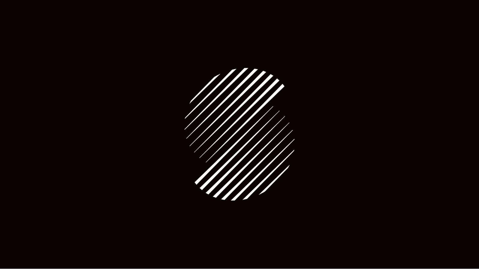
Logo: Our logo, two half circles representing the two pillars of media and tech, still match our ethos of driving adtech innovations that solve real-world media needs. So the logo has been enhanced with new colours that convey our adtech focus in a more modern, visually appealing way. As the market already knows our brand well, we also have new variations that focus solely on our symbol.
Colour palette: Primary colours of black and white bring clarity and a sense of limitlessness to the brand, reflecting its constant state of innovation. A revitalised palette of secondary and tertiary colours adds a fresh feel that better captures the essence of our cutting-edge technology. And the introduction of gradients further helps to convey our state of constant development, ensuring we stand out from the crowd with a distinctive design that moves beyond flat colours.

Typography: The Aeonik typeface creates a big, bold, and timeless brand identity, echoing our goal to develop technology that is not only ahead of the pack but also stands the test of time.
3D technology animations: We can’t — and don’t want to — deny the complexity of adtech. But we do want to simplify it and make it more tangible. To achieve that, we’ve swapped flat diagrams for a more dynamic and immersive approach, using 3D static and motion graphics that offer creative visualisations of our adtech — something that very few, if any, adtech companies have done yet.
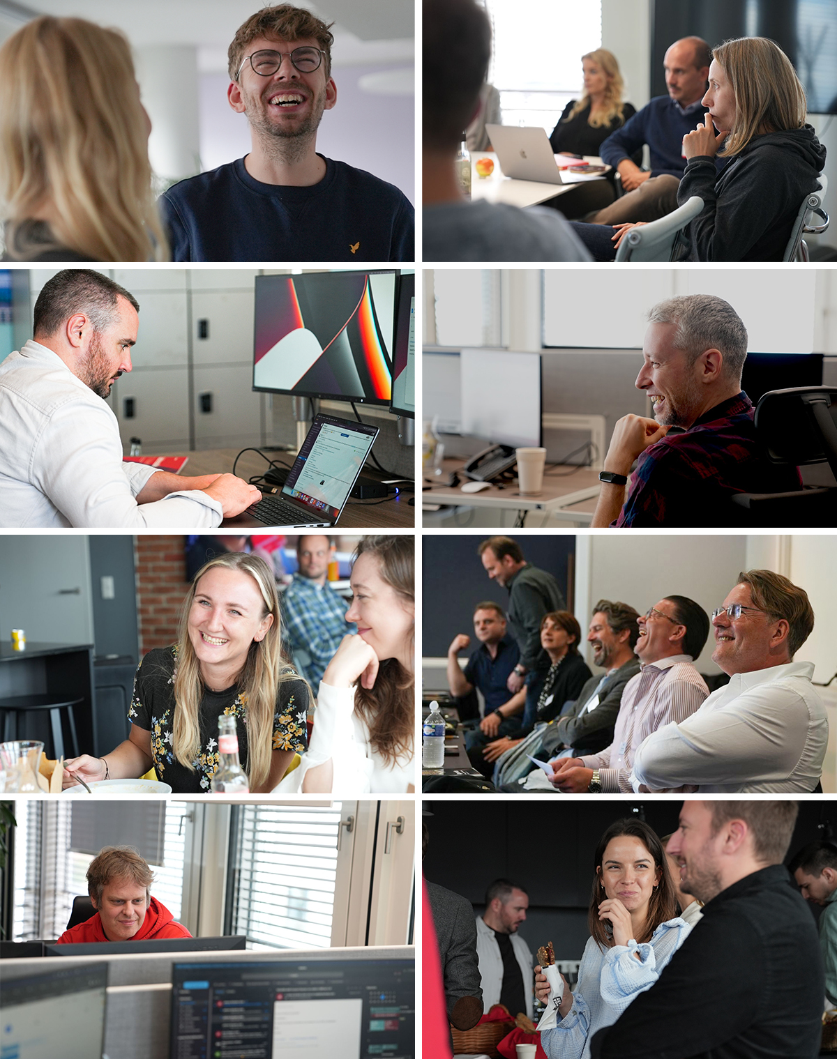
Photography: Instead of relying on generic stock images — which is common in tech marketing — we want to embody our people-first approach by telling the story of our company and our products through the faces of our people. To achieve this, I hired a professional photographer for every company, partner, and client event over the last three years, so the images you see are all people who work for us or with us.
To better communicate our offering and brand personality, we have created a new brand messaging architecture. Our new purpose, vision, and mission reflect the key principles that underpin our business today:
Although our former tagline (“Defining the future of video advertising”) still rings true — we are still impacting the future course of our industry — we have revised our tagline to “Engineering the future of TV advertising”, which better reflects our new core focus and target audience. When visiting our website, you will see that ‘TV advertising’ rotates with ‘online advertising’ and ‘audio advertising’, which also reflects the scale of our capabilities beyond the big screen. Our company boilerplate has also been adapted to clarify our new messaging, and new brand voice and tone guidelines have been developed to ensure consistent messaging and personality in all written communications.
Alongside our new design and messaging architecture, our new website enables us to apply our new design principles and bring clarity to our offerings, identity, and purpose.

We’ve introduced a number of new changes to give a more modern tech-user interface feel.
We’ve also redesigned our site to better engage our new core audience groups: European broadcasters and prospective employees.
Our broadcaster-centric pages are full of resources to engage their interests and enhance their knowledge not only of what we offer but also with regards to what’s new in our industry.

And we have dedicated department pages and culture pages for our prospective employees, giving them a real feel of what it’s like to be a ‘smartclipper’.

A standard FAQ felt far too basic for such a progressive tech company, so we integrated a chatbot. By talking to ‘Sarah’, future employees can easily find out what opportunities we offer and who to contact to find out more.

The launch of our new website is just the start of our brand refresh, and we’ll continue to roll out our new identity in the coming months across all owned and partner assets. So whether you’re working with us, want to work with us, or have only just met us, we hope our new brand identity gives you a clear insight into our company, our people, and our adtech, as we continue to engineer the future of TV advertising.
Update: (2 February 2024) Since the publication of this article, smartclip’s new brand identity and website have won two 2024 German Design Awards in the category of “Excellent Communication Design”.

Shira Leffel is the VP of Marketing at smartclip, the adtech business of RTL Group. She leads the marketing and product education department, helping Europe’s largest broadcasters adopt innovative advertising technology solutions. With over 10 years of marketing leadership experience across tech—ranging from startups to public companies—Shira specialises in transforming complex technology into compelling, marketable stories. Her career has taken her across the globe, with roles in the United States, Canada, Israel, Mozambique, Brazil, and now Germany, shaping her inclusive and impactful approach to marketing. Shira graduated Summa Cum Laude and First in Class with an M.A. from Tel Aviv University and First Class Honours with a B.A. from the University of British Columbia.
Shira Leffel
VP Marketing & Product Education

